Hi, that’s the name of a telecom provider in the Netherlands aimed at the younger people among us. This campaign website back in 2007 Q2 was convincing people of all the advantages of internet on your mobile phone. From then on you would be able to read the news, chat, check your email and plan your public transport journeys on the go. But the website also offered an overview of fun and interesting websites for mobile phones.
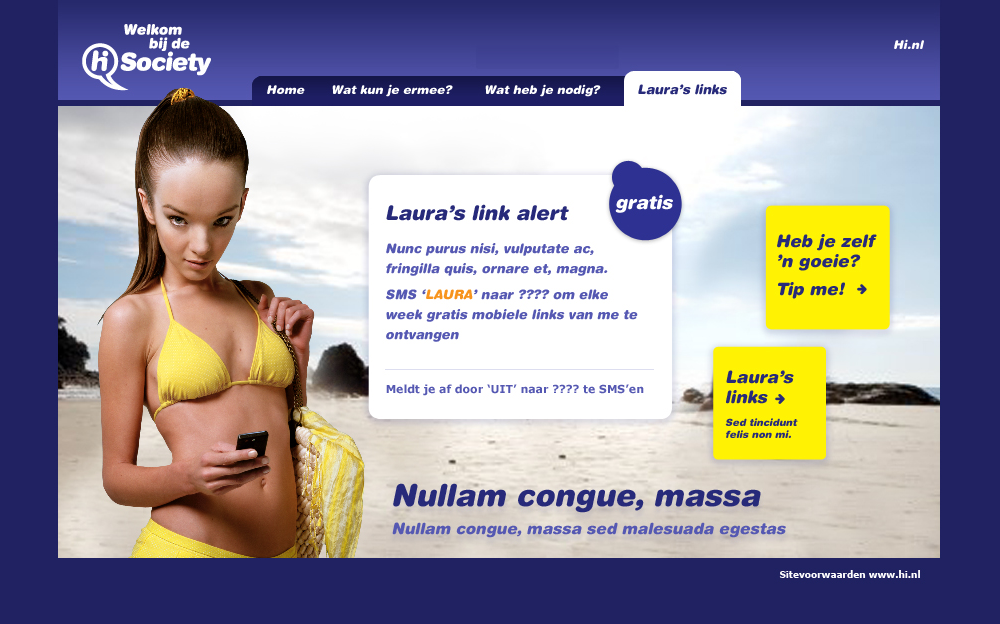
The creative concepts at Hi in that period were all about people with physical ‘abnormalities’. A guy that was continuously texting had an enormous thumb, and thus a girl, Lucy, had a huge head because of all the mobile knowledge overload. Lucy showed you how to setup internet access on your mobile phone and she would update you on new cool mobile websites.
Information architecture
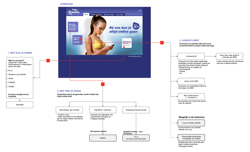
An overview of all content of the campaign site.
Agile process
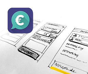
This project was a lot of fun because of the agile design process. No digital wireframes were made during this projects. Only sketches which were directly transformed into visual design and flash action scripting. Together with the client we were able to finish a first version of the campaign within a very tight schedule. And while it was live we detailed and finished the site and updated it with an optimized version.
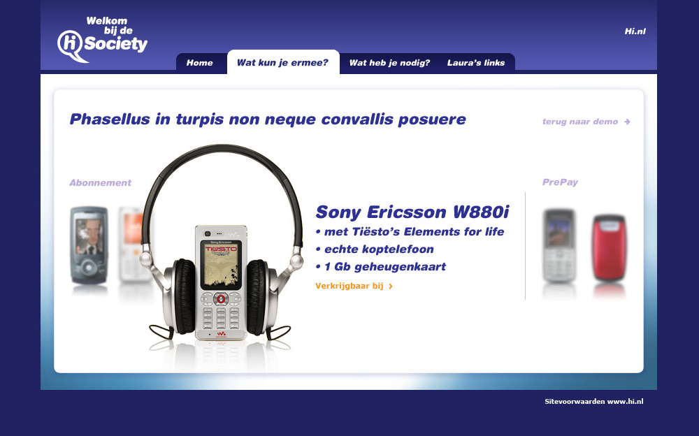
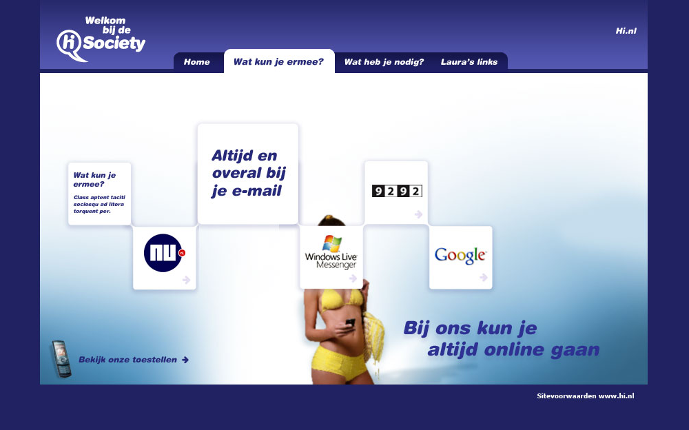
Some fun examples on how you could use your mobile phone with internet connection. A flash animation that showed the different website one by one including a screencast/movie of the mobile sites. The animations had the same motion design as used in the tv commercials.

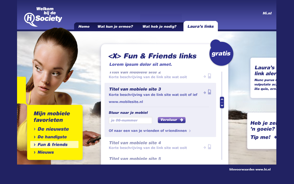
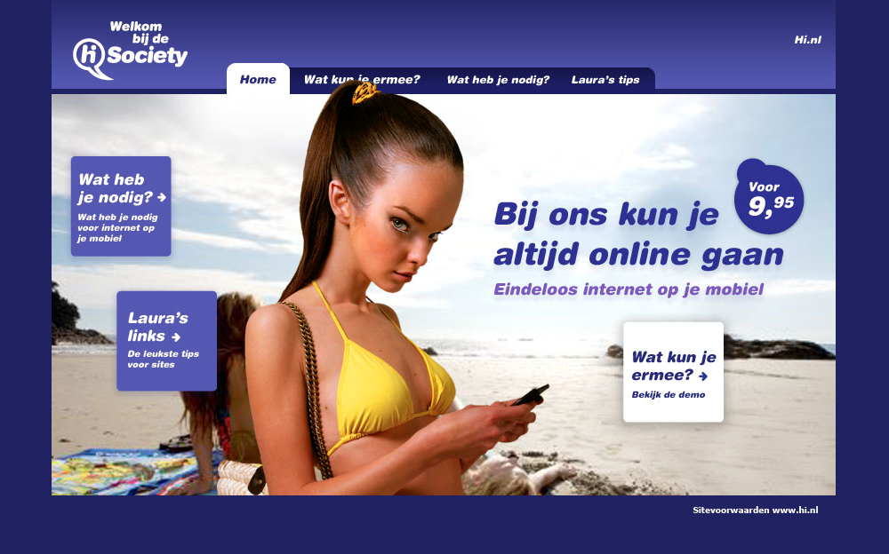
After having seen what you could you, you were told what you needed: a mobile phone with internet mobile data subscription. And the last part was Lucy’s links, were you could get fun links and submit websites you discovered yourself.
A great campaign, with only one remark from my side; a mobile version of the site would have been the cherry on the cake.
