Probably the project I am most proud of; my graduation project back in 2006. The iPhone wasn’t even invented (as far as the world knew) and Nokia was still the phone to beat. At that time Flash on mobile phones (flash lite) was pretty popular in Asia. And a lot of fun stuff was already done for the crazy color & animation loving Asians. But then Adobe/Macromedia launched a beta of Flash Lite 2. It all got even better, RIA on mobile would soon be possible.
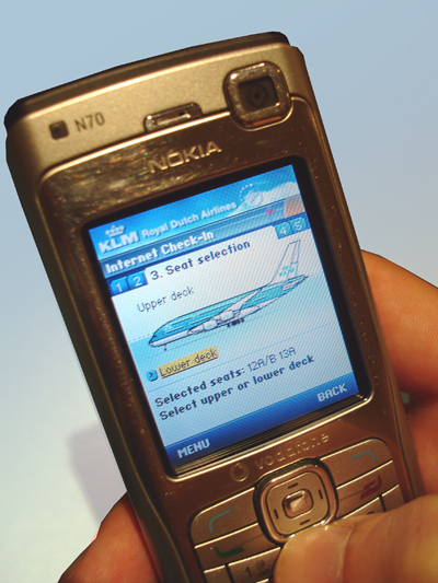
So I had the opportunity to work on a concept for KLM; transferring the internet check-in application to mobile. I had to do the project myself from start to finish: research, concept, interaction design, visual design and a working demo to do a simple usability test.
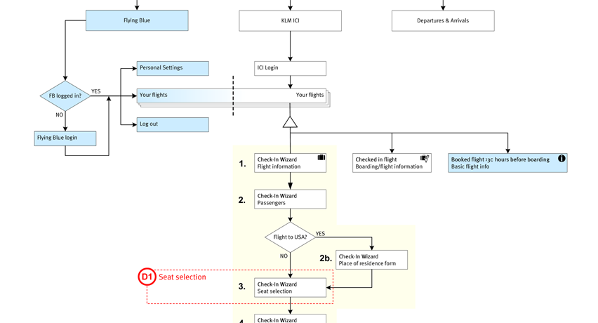
Internet Check-in flow
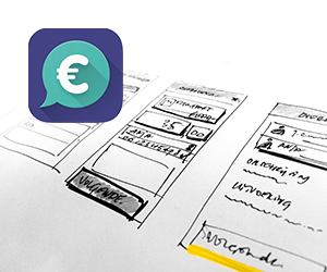
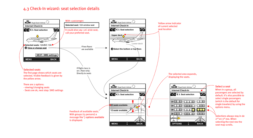
Wireframes
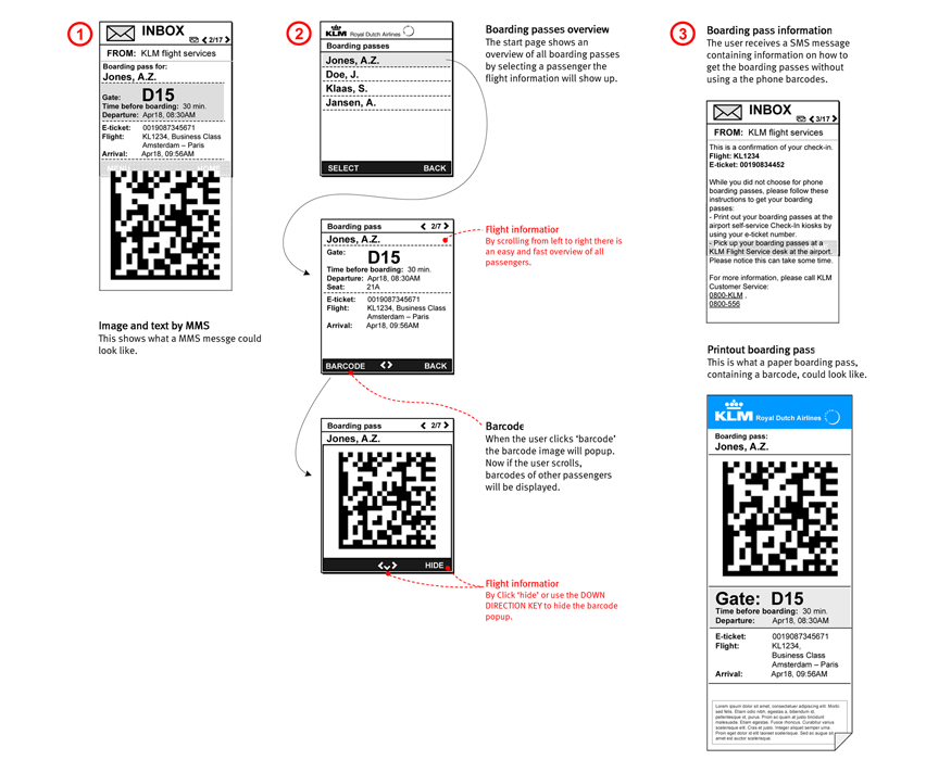
The main goal of the ‘app’ was no doubt checking in. KLM has Flying Blue, a membership for frequent flyers, which could be used for an easy check-in. Other users have to enter their e-ticket number and log in to select the desired flight. There you had the option to select or change your seats. If you were with a group of people (family or friends for example) the best seats would be picked when moving through the seatmap. And finally you would get you digital boarding pass on your mobile with a QR-code.
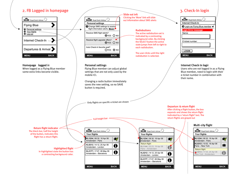
Visual design concepts
Different styles according to the KLM branding. Went with the lighter ones.
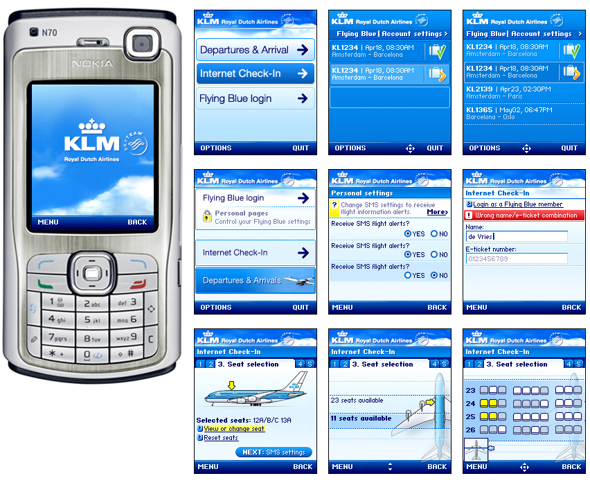
Working demo in Flash Lite 2
Finally a working Flash lite 2 demo on a Nokia N70 to do a usability test. Doing some flash development on was fun, but the demo was mainly needed to really feel the product and test controlling the navigation by using only the direction and select buttons. Couldn’t have tested that with designs only.
Months after that the world got to know the iPhone. Everything had a touchscreen and Flash was depreciated..
